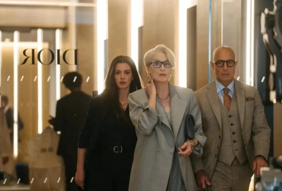
Fashion has always borrowed from film, but Fall 2026 marked a rare moment when a movie sequel and a runway forecast moved in visible sync. As anticipation built around "The Devil Wears Prada 2," industry conversations began linking its visual direction to the official Pantone color trend unveiled during New York Fashion Week. The overlap was not accidental. According to WWD, the sequel's aesthetic energy aligned closely with the shades highlighted in Pantone's Fashion Color Trend Report for the season.
New York Fashion Week has long served as a cultural thermometer. Designers present collections that respond not only to fabric innovation and tailoring shifts, but also to wider emotional and social undercurrents. For Fall 2026, those undercurrents included nostalgia, authority dressing, and a renewed appreciation for intentional color choices. The sequel to a film that once turned a cerulean sweater speech into a pop culture reference point arrived at precisely the right time.
Why Film Still Influences Runway Color Stories
Color forecasting does not happen in isolation. Pantone's seasonal reports are developed through research that examines global events, art, entertainment, lifestyle patterns, and runway previews. Film often plays a supporting role in that research, especially when it generates strong visual language.
The original "The Devil Wears Prada" became iconic not just for its characters but for its sharply defined fashion identity. Structured silhouettes, commanding neutrals, and strategic pops of saturated color shaped audience memory. With the sequel reintroducing that world to a new generation, stylists and designers found themselves revisiting those cues.
Inside the Pantone Color Trend for Fall 2026
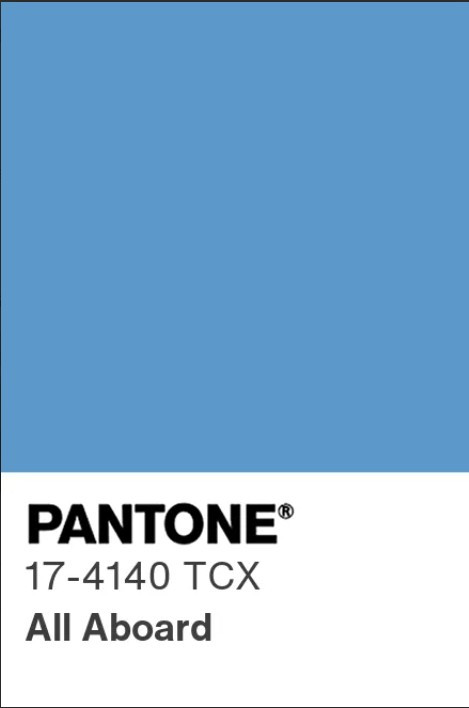
Pantone's Fashion Color Trend Report for New York Fashion Week Fall 2026 emphasized contrast. On one side were stable, reliable hues such as warm browns, layered neutrals, and softened grays. On the other were confident statement colors that punctuated collections with energy.
The palette reflected what many observers described as a return to polish. Rather than chaotic brights or fleeting novelty shades, designers embraced colors that communicated intention. Rich espresso tones, deep wine shades, refined blues, and modernized reds appeared across tailoring, outerwear, and evening pieces.
This duality between grounded and expressive color mirrors the thematic tension long associated with "The Devil Wears Prada." The fictional fashion world portrayed in the film series thrives on discipline and spectacle at the same time. That balance appeared on the Fall 2026 runways at New York Fashion Week, where structured coats in neutral palettes were often paired with bold accessories or jewel-toned accents.
New York Fashion Week as a Cultural Stage
New York Fashion Week provides the first major platform each season for designers to interpret Pantone's guidance. While the color report is released to align with NYFW, it also reflects what designers are already presenting. The relationship is cyclical.
During Fall 2026 shows, collections showcased tonal layering and monochromatic dressing that leaned into Pantone's direction. Head to toe brown ensembles, slate blue tailoring, and carefully styled crimson elements suggested a coordinated shift rather than scattered experimentation.
The timing of "The Devil Wears Prada 2" publicity amplified attention on these choices. Social media comparisons between sequel set images and runway looks circulated widely. Fashion commentators pointed out similarities in power suiting, sleek outerwear, and color blocking choices that felt deliberate rather than coincidental.
While no single film determines a Pantone color trend, the heightened visibility of the sequel created a shared reference point. When audiences saw similar hues on screen promotions and on NYFW runways, the connection became part of the broader narrative surrounding Fall 2026 style.
The Return of Power Dressing Through Color
One of the strongest through lines connecting the sequel buzz and the Pantone color trend was the resurgence of power dressing. Structured blazers, tailored trousers, and statement coats dominated Fall 2026 collections at New York Fashion Week.
Color played a central role in redefining that power aesthetic. Instead of relying solely on black, designers explored depth through saturated burgundy, forest tones, and complex neutrals. These shades projected authority without appearing severe.
The original film helped popularize the visual shorthand of fashion authority. The sequel's arrival reminded the industry of how impactful that image can be. Pantone's report reflected a season where color reinforced confidence, rather than serving as decoration alone.
How Designers Translate a Pantone Color Trend
Pantone's Fashion Color Trend Report is not a strict rulebook. Designers interpret it in ways that align with their brand identities. Some adopt the palette directly, while others use it as a starting point.
At New York Fashion Week Fall 2026, several collections demonstrated subtle integration. Instead of presenting entire lines built around one standout shade, designers used accent pieces or layered tonal variations to echo the report's guidance. This approach created cohesion across shows without making the trend feel repetitive.
The result was a season that felt connected yet varied. Viewers could trace a consistent mood across runways, but each designer maintained individuality. The influence of "The Devil Wears Prada 2" functioned similarly. It provided a shared aesthetic memory that designers could reference loosely without copying directly.
What This Means for Fall 2026 Wardrobes
For consumers and retailers, the Pantone color trend linked to New York Fashion Week offers practical direction. Fall 2026 appears poised to favor intentional color stories.
Layered neutrals will likely dominate outerwear and tailoring, while saturated accents may surface in knitwear, handbags, and footwear. The cinematic resonance of the sequel adds storytelling appeal, giving shoppers a cultural anchor for their choices.
The alignment between a major film release and the Pantone report also reinforces the idea that color trends are emotional markers. They reflect collective memory as much as forward thinking design.
Fall 2026 Color Forecast Signals a Cinematic Shift in Fashion
The intersection of "The Devil Wears Prada 2," the Pantone color trend, and New York Fashion Week Fall 2026 highlights how fashion continues to draw from storytelling beyond the runway. The season's palette captured a blend of nostalgia and renewed authority, offering shades that feel both familiar and modern. As designers reinterpret these colors for retail and editorial spreads, the connection between cinema and runway remains visible. Fall 2026 demonstrates that when cultural icons return, they can shape not only silhouettes and styling, but also the very colors that define a season.
© Copyright Fashion Times 2026. All rights reserved.


