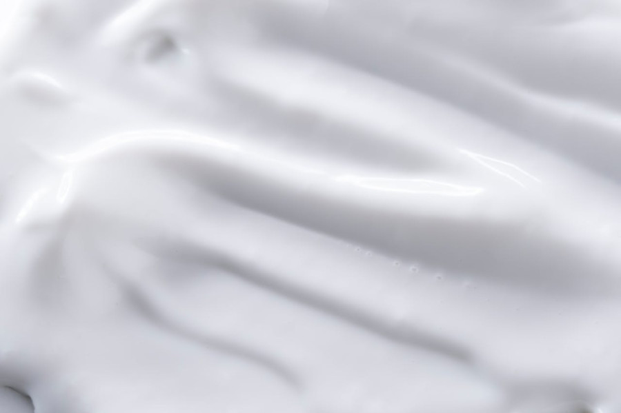
It's that time of the year when Pantone announces their much-awaited Color of the Year, and for 2026, the company chose one that left people scratching their heads in confusion. Unless you've been living under a rock for the past week, the Pantone Color of the Year for 2026 is Cloud Dancer. To a regular person, perhaps they'll simply say Cloud Dancer is a fancy way to call the color white. However, Pantone describes it as "a symbol of calming influence in a society rediscovering the value of quiet reflection. It sounds like a positive thing, so why is everyone up in arms about this color selection?
The History of Pantone
Let's go back in time so we'll have a better understanding of how Pantone color selections work. It all began sometime in the 1950s, when a man named Lawrence Herbert realized the inconsistencies of colors while working at a printing firm in New Jersey. Herbert went on to create a simple solution to this problem: standardize the pigment system. In 1963, the Pantone Matching System or PMS was finally launched. The rest, as they say, is history.
The actual practice of selecting the Color of the Year started in 1999, with Cerulean as the first and official color of the new millennium. It has since then become an annual tradition, and people have started to look forward to these reveals as they typically influence what fashion trends may come in the new year.
Questionable Color Choices
The Pantone - color of the year for 2026 is WHITE! 
— Rashi (@rashi_kakkar) December 4, 2025
So the color of the year is the absence of all color.
How dreadfully boring.🥱 pic.twitter.com/i3ZzqeSUNz
The announcement of Cloud Dancer was highly talked about due to a variety of reasons. Some people think that it's a lazy or boring choice, yet some argue that it makes sense to choose a more peaceful color amidst all the craziness happening in the world. Of course, no one will ever collectively agree that Cloud Dancer is good since people will always have something to say, regardless of the color.
Fearless Color Forecast
Now that we've got that out of the way, we can focus on more exciting things. Pantone selections have always historically influenced everything under the sun, from fashion, interior design, and even makeup. With Cloud Dancer, it's easier to match it with any hue from the palette since it's a neutral tone. You can also play with textures and bold prints since it'll still be balanced out by Cloud Dancer. It's a versatile shade that works well by itself or with another.
Frosty eyeshadows and white eyeliners may have a comeback similar to how trendy they were back in the 2000s. We're unsure how this would be received today since most women prefer a no-makeup makeup look. But it's still worth a try, at least for nostalgia's sake.
As for interior design, Cloud Dancer may get a bit tricky to incorporate since it resembles a blank slate. But again, you could say that's the beauty of it. This is not something new; we've already seen this before. The only difference is that Cloud Dancer (or milky white, if you will) is the Pantone Color of the Year. It's the best opportunity for us to run wild with imagination. With this shade at the forefront, the possibilities are endless.
© Copyright Fashion Times 2026. All rights reserved.


